Calamita: A Standout 3D Display Typeface for Digital Branding
There I was—midway through building a new landing page for a ceramicist’s online studio—when the hero section felt flat. The client’s beautiful hand-thrown mugs and minimalist glazes deserved typography with presence, depth, and quiet confidence. That’s when I dropped Calamita into the headline field and watched the whole layout exhale. Suddenly, the “Handmade in Portland” tagline had dimension—not just visual weight, but tactile energy. It wasn’t just bold; it felt sculpted.
What Makes Calamita Shine on Screen
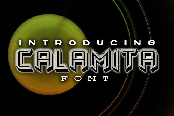
Calamita is a premium display typeface, designed intentionally for impact—not endurance. Its 3D effect isn’t gimmicky or over-rendered; it’s subtle, refined, and built with clean vector geometry that scales beautifully across devices. Unlike some display fonts that blur or pixelate at larger sizes, Calamita holds crisp edges even at 120px on high-DPI screens. I tested it across Chrome, Safari, and Firefox on desktop and mobile—and every time, the extrusion effect remained legible and intentional, never distracting from the message.
The personality is warm but polished: modern without coldness, distinctive without shouting. It leans into craftsmanship—think letterpress meets digital precision. That makes it ideal for creative brands: makers, coaches, boutique studios, and course creators who want their web presence to feel human-made, not templated.
Where Calamita Performs Best (and Where to Pause)
In practice, Calamita thrives where attention needs direction:
- Hero headlines — especially over textured backgrounds or soft image overlays (I used it over a muted photo of clay drying racks—no contrast issues)
- Section dividers — like “Our Process” or “Why Handmade Matters” on portfolio or service pages
- Call-to-action buttons — when styled with generous padding and ample spacing (avoid cramming it into tiny mobile CTAs)
- Landing page banners — for limited-time offers, new collections, or seasonal launches
- Branded digital assets — think downloadable lookbooks, email headers, or social media cover graphics embedded in web layouts
It’s not built for long-form reading. I tried using Calamita for a testimonial block—loved the first line, but by the third sentence, scanning slowed. For body copy, navigation labels, form fields, or dense dashboard interfaces, stick with a highly legible sans serif like Inter, Poppins, or a clean serif like Cormorant Garamond. Calamita’s role is emphasis, not exposition.
Responsive Behavior & Real-World Readability
On mobile, Calamita stays strong—but only when given room. At 48px on a 375px viewport, it reads cleanly as a headline. Below 36px? The 3D detail starts to soften, and letterforms can visually merge. My rule now: use Calamita at headline sizes only on mobile (H1–H2), and always pair it with a responsive fallback stack in CSS. I load it via @font-face with WOFF2 support and include a system font fallback—never rely on the 3D effect alone for meaning.
Contrast matters too. On light backgrounds, Calamita’s shadow layer adds lovely depth. Over dark imagery, I adjusted the extrusion color slightly lighter than default (using CSS text-shadow overrides) to preserve clarity. And yes—it works over photos, but avoid busy textures directly behind tight letter spacing. A subtle overlay or blurred background zone helps it land with intention.
Smart Pairing for Cohesive Digital Identity
Calamita sings when paired with purpose. I’ve landed on two reliable combinations:
- With a neutral sans serif — like Inter or Manrope for all body text, buttons, and UI elements. This creates clear hierarchy: Calamita commands attention, while the sans keeps everything grounded and scannable.
- With an editorial serif — like Playfair Display or Literata—for blogs or storytelling sites where voice and authority matter. The contrast between Calamita’s dimensional presence and the serif’s classic rhythm feels both contemporary and timeless.
Avoid pairing it with other decorative fonts—especially scripts or heavy display serifs. Calamita has enough character to hold its own. Let it lead; let the rest support.
Practical Checks Before You Implement
Before dropping Calamita into a live project, I always verify:
- Webfont formats included — WOFF2 is essential for performance; check if EOT or TTF are bundled for legacy support (rarely needed today, but good to know)
- Weight availability — Calamita shines in its regular weight, but confirm whether bold or italic variants exist (they don’t—and that’s fine; its strength is singular focus)
- Licensing clarity — ensure the license covers commercial websites, client work, SaaS platforms, and embedded digital products (not just personal use)
- Character set — it supports Latin-based languages well, but double-check if your audience needs extended diacritics or currency symbols
- Load strategy — I preload Calamita’s WOFF2 file and apply
font-display: swapso text remains visible during load
One last note: Calamita isn’t a logo font—but it *is* a powerful logo-adjacent tool. Use it in animated SVG headers, branded section titles, or interactive hover states. It adds polish without sacrificing performance, and it tells users, wordlessly, that this brand values craft—even in code.